


This boutique new law firm specialising in the health sector required an identity that echoed their positive, proactive approach to business and their desire to be a centre of excellence.
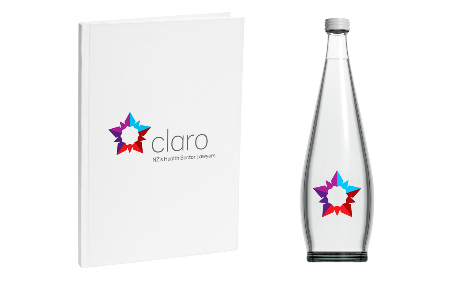
The name Claro means clarity and focus – traits that the clean, sharp identity is built around.
5 shapes (each representing a partner in the business) form a star which serves as a strong visual icon for the brand. A curved-edged quality seal sits in the centre of the star – referencing the company as a centre of excellence.
The project included art directing a photoshoot of the partners, designing the website and producing key stationery items.